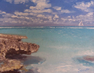
"pochade" French for little sketch box. Field studies and sketches by Jim Serrett
Friday, December 24, 2010
Thanks for listening.
Here we are at the end of another year, and I wanted to thank everyone for their support and interest. Many of you took the time to leave some thoughtful and challenging comments on my work; I can not tell you how much it is appreciated. If I did not respond directly to your comment I assure you that my lack of response was either circumstances or procrastination. Which ever case, be assured I value each and every comment, again my sincerest gratitude.
The goal with my blogs (Studio and Pochade) has been pretty simple. To attempt to publish at least one article on each site per month, with some type of content that may be of interest to artists or art patrons. I make no claims to great expertise but do profess a great desire to learn as much as I can about the nature and language of my craft, painting. And I know the most important pieces of information I have been given have come directly from conversations and exchanges with other artists that are kind and generous enough to share their skills and knowledge. I hope I can share the creative wealth and pass along, in some small way those gifts.
Happy Holidays and have a great New Years.
Jim
Join Creative Commons, http://creativecommons.org/
Creative Commons is a nonprofit corporation dedicated to making it easier for people to share and build upon the work of others, consistent with the rules of copyright.
Saturday, October 30, 2010
The whole is greater than the sum of its parts.
Learning to simplify.
Setting up your sketch box and starting a painting on location can at times be overwhelming. Sorting through all of nature’s complexities and distilling that information down to its basic elements is no easy task. When confronted by the natural world, at times it seems we are trying to bring order to chaos? Even once we have the forms and masses blocked in we still must decide on how much pictorial detail (what to put in, what to take out) we need to include to convey the scene and intention of the piece.
The best advice to simplify your subject is to see it as uncomplicated complete patterns of shape, massing in shapes like puzzle pieces and eliminating unnecessary details. This is certainly a well founded and conventional approach. But only as long as we keep the intention of the scene and see the patterns of the whole. So no matter how simple we begin we are always involved with composition. And to simplify composition we need to understand its elements.
If a really great painting is more about what we leave out than put in, we need to know what those things are that we left out.
Most artists have already been given the tools to deal with simplifying way back in the basic design classes we took. Condensing complex imagery into understandable and communicative forms is basic design fundamental.
The Elements of Art: -Form-Line- Shape-Color-Texture-Space-Value
The Principles of Design: -Emphasis-Balance-Harmony-Variety-Movement-Rhythm-Proportion-Contrast-Unity.
The organization of these fundamentals forms composition. Composition is the organization of related elements into a meaningful coherent whole.
The word composition means put together – “com” is together – “ponere” means put.
So it is the “act” of composing or compounding. The mechanics of composing can be analyzed by these formal fundamentals separately however these elements become interrelated and dependent upon the other.
So it is important to appreciate them individually and but more importantly
understand them when acting together.
This idea is beautifully and simply express by a great Greek philosopher.
An artist needs a strong understanding of these fundamentals to compose and to simplify.
They are tools that will be used over and over and need to be embedded in a students mind so that they can become instinctive and non cognitive.
"A painter needs to study, meditate and experiment and practice interminably in order to produce a painting that would have nobility in its concept, variety, rhythm, repetition, unity, balance and harmony in its composition"
-- ( Edgar A. Payne )
"There can be no dissent from the maxim, that a knowledge of integral parts is essential for the construction of a whole - that the alphabet must be understood before learning to spell, and the meaning of words before being able to read"
--From Asher B. Durand's 1855 Letters on Landscape Painting
Learning to see the whole.
Select a great work of art you truly admire and critique it by basic design fundamentals.
One can quickly pick out the artists use of elements and principles, and still not find what exactly gives that particular work its excellence or intrinsic appeal. (Elegance and beauty). There is an inherent quality in great masterpieces that defy/challenge technical analysis or description. To see the aesthetic value, we often have to look for what is not there. This leads to the second aspect of composition, which is more intuitive and based on our feelings or sense towards the subject, “Expression”, which we must consider an element of composition, no matter how elusive or hard it may be to describe. Is the most powerful and lasting element in art. It can make contact with our senses, emotion and intellect.
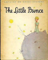 L'essentiel est invisible pour les yeux.
("One sees clearly only with the heart. The essential is invisible to the eyes.")
The Little Prince by Antoine de Saint-Exupéry
We can mimic each of those elements, combine them and not create a work of art of any inherent value. Why, because we create art as a whole, it is not a collection of pieces.
This intrinsic appeal or quality transcends fundamentals for they have become second nature to a master painter. It is a deep bedded artistic language requiring no more effort on their part than breathing. What we must emulate is the intellectual process, making fundamentals an innate part of our daily thinking and artistic vocabulary.
“A main objective in the art of painting is to disguise, insofar as possible, the use of methods or the influence of principles.
This concealment creates, so to speak, a great mystery – an attractiveness, unseen and indescribable. This abstract quality is the element that places pictorial work in the realm of fine art.”
- - (Edgar A. Payne)
I started this article wanting to talk about learning to simplify. So how did an article about understanding the essentials evolve into such large topics as the elements of art, principles of design, Aristotle, Gestalt theory and intrinsic appeal?
A well composed painting is a complex thought process of simplification.
Simplification “is” composition. To create compositions we must understand elements of art intrinsically. So that we can remove them at will creatively and inventively.
Great composition is more a matter of what you leave out than what you put in.
Explore - Question - Learn - Enjoy, Jim
Links:
Edgar Payne Gallery
Composition of Outdoor Painting by Edgar A. Payne
Asher B. Durand - biography
Current Durand Exhibition / Madrid
Kindred Spirits - Asher Durand and the American Landscape
Credits:
Statue of Aristotle at the university of Freiburg im Breisgau, Germany.
By Cipri Adolf Bermann (1862–1942)
Photo: Michael Schmalenstroer
Mr. Payne and Mr. Durand and Mr. Aristotle and Mr. Saint-Exupéry
Setting up your sketch box and starting a painting on location can at times be overwhelming. Sorting through all of nature’s complexities and distilling that information down to its basic elements is no easy task. When confronted by the natural world, at times it seems we are trying to bring order to chaos? Even once we have the forms and masses blocked in we still must decide on how much pictorial detail (what to put in, what to take out) we need to include to convey the scene and intention of the piece.
The best advice to simplify your subject is to see it as uncomplicated complete patterns of shape, massing in shapes like puzzle pieces and eliminating unnecessary details. This is certainly a well founded and conventional approach. But only as long as we keep the intention of the scene and see the patterns of the whole. So no matter how simple we begin we are always involved with composition. And to simplify composition we need to understand its elements.
If a really great painting is more about what we leave out than put in, we need to know what those things are that we left out.
The Elements of Art: -Form-Line- Shape-Color-Texture-Space-Value
The Principles of Design: -Emphasis-Balance-Harmony-Variety-Movement-Rhythm-Proportion-Contrast-Unity.
The organization of these fundamentals forms composition. Composition is the organization of related elements into a meaningful coherent whole.
The word composition means put together – “com” is together – “ponere” means put.
So it is the “act” of composing or compounding. The mechanics of composing can be analyzed by these formal fundamentals separately however these elements become interrelated and dependent upon the other.
So it is important to appreciate them individually and but more importantly
understand them when acting together.
This idea is beautifully and simply express by a great Greek philosopher.
“The whole is more than the sum of its parts.” Aristotle
They are tools that will be used over and over and need to be embedded in a students mind so that they can become instinctive and non cognitive.
"A painter needs to study, meditate and experiment and practice interminably in order to produce a painting that would have nobility in its concept, variety, rhythm, repetition, unity, balance and harmony in its composition"
-- ( Edgar A. Payne )
"There can be no dissent from the maxim, that a knowledge of integral parts is essential for the construction of a whole - that the alphabet must be understood before learning to spell, and the meaning of words before being able to read"
--From Asher B. Durand's 1855 Letters on Landscape Painting
Learning to see the whole.
Select a great work of art you truly admire and critique it by basic design fundamentals.
One can quickly pick out the artists use of elements and principles, and still not find what exactly gives that particular work its excellence or intrinsic appeal. (Elegance and beauty). There is an inherent quality in great masterpieces that defy/challenge technical analysis or description. To see the aesthetic value, we often have to look for what is not there. This leads to the second aspect of composition, which is more intuitive and based on our feelings or sense towards the subject, “Expression”, which we must consider an element of composition, no matter how elusive or hard it may be to describe. Is the most powerful and lasting element in art. It can make contact with our senses, emotion and intellect.
 L'essentiel est invisible pour les yeux.
("One sees clearly only with the heart. The essential is invisible to the eyes.")
The Little Prince by Antoine de Saint-Exupéry
This intrinsic appeal or quality transcends fundamentals for they have become second nature to a master painter. It is a deep bedded artistic language requiring no more effort on their part than breathing. What we must emulate is the intellectual process, making fundamentals an innate part of our daily thinking and artistic vocabulary.
“A main objective in the art of painting is to disguise, insofar as possible, the use of methods or the influence of principles.
This concealment creates, so to speak, a great mystery – an attractiveness, unseen and indescribable. This abstract quality is the element that places pictorial work in the realm of fine art.”
- - (Edgar A. Payne)
I started this article wanting to talk about learning to simplify. So how did an article about understanding the essentials evolve into such large topics as the elements of art, principles of design, Aristotle, Gestalt theory and intrinsic appeal?
A well composed painting is a complex thought process of simplification.
Simplification “is” composition. To create compositions we must understand elements of art intrinsically. So that we can remove them at will creatively and inventively.
Great composition is more a matter of what you leave out than what you put in.
Explore - Question - Learn - Enjoy, Jim
Edgar Payne Gallery
Composition of Outdoor Painting by Edgar A. Payne
Asher B. Durand - biography
Current Durand Exhibition / Madrid
Kindred Spirits - Asher Durand and the American Landscape
Credits:
Statue of Aristotle at the university of Freiburg im Breisgau, Germany.
By Cipri Adolf Bermann (1862–1942)
Photo: Michael Schmalenstroer
Mr. Payne and Mr. Durand and Mr. Aristotle and Mr. Saint-Exupéry
Thursday, September 16, 2010
“Better a diamond with a flaw than a pebble without.”
Confucius
I am by nature a more academic painter in the studio so field sketching can be a great departure for me. My approach to sketching is to allow myself the freedom to discover the image and explore the medium, keep to the fundamentals and just observe and experiment.
I often wonder about the percent of paintings that work out.
But in reality all studies are successful if there is at least one thing learned or idea born from them. I think as you get some time and distance from your sketches you can see their qualities with fresh eyes.
I like the starts better than the more resolved sketches. They leave a bit to the imagination but still carry a sense of place. When it comes to sketching on location I think its better to have many good starts then to keep plowing along on a little canvas trying to get it to work for you.
The adage is that if you want to be good at anything you have to work at it. An artist can work all day, cover miles of canvas, and accomplish absolutely nothing; an artist must be dedicated to growth, the journey of invention and discovery.
That is what gives you confidence.
I like the definition from Wikipedia for oil sketch.
All are oil on panel, 8x10 with the last sketch 5x7.
Thursday, August 5, 2010
Pirates of the Pochade
Exploring the streams and lakes can be truly inspirational. These secluded lakes are very rich with natural beauty. They are special secluded places which have endless gorgeous painting spots to discover. And I am just as happy being out there painting or paddling.
Either way it is a great experience.
I upgraded last summer to this 15 foot Charleston Touring Kayak by Dagger, just a great boat that moves like a hot knife through butter. Very stable and nimble, plus you can carry a good load of gear in the dual hatches. It feels like I’m becoming early frontier explorer or maybe a pirate.
The painting is of Linda in her kayak leading the way on a warm summer afternoon.
9x12 Oil on panel
Explore - Question - Learn - Enjoy Jim
Monday, June 28, 2010
Three Color Palette
Further on down the road
10x8
Oil on panel
If you have been doing a lot of studio work, it’s easy to fall into a routine.
Your color sense and choices can become predictable. The best way to shake those cob webs is get outside and do some sketches with a limited palette.
Midwest Scenic
7x9
Oil on panel
These pochades were done with a three color palette of cadmium yellow, permanent alizarin and French ultramarine. The simple three primaries will produce an inherent set of color harmonies. I wrote about this limited palette earlier here. You may not match every color you see perfectly but you will certainly produce better overall color harmony.
Using a limited palette will force one to truly look at what those secondary colors are composed of, and push you to really see the color qualities of temperature, value and chroma/intensity.
Out the backdoor
10x8
Oil on panel
A limited palette and some quick sketches can be refreshing. In the end it’s about being able to express what you see through color. It is about gaining experience, not producing frameable work after all. Art is not about a product, but an evolving and developing process.
I learn something from every painting I do, even if it’s only what not to do next time.
The lesson this week is to paint and persevere.
Plain and simple.
Enjoy Jim
Friday, April 23, 2010
Mixing the color Green
Mixing the Color Green / Early Spring
Spring has always been considered a time of rebirth, renewal, and growth.
For artists it is a return of a favorite muse, or maybe we should say a cunning nemesis called GREEN!
Let’s face it, artists have a love hate relationship with the color green.
Maybe its those 70's era mint green walls my mother had, or the descriptive words people commonly associate with green, lime green, kiwi green, pea green and yes the infamous sea foam green.
What the heck is sea foam green?
I doubt any other color has as many preconceived ideas or notions surrounding it.
Further confounding the problem is the use/abuse of premixed, manufactured tube greens. Combined, these can easily lead to some very artificial looking colors which can completely zap the life out of any painting.
And yet for a landscape painter it is this color we must deal with most often.
To deal with green we must get rid of the preconceived notions.
Early spring is the best time of year to develop an understanding of mixing the color green. We still have a great deal of winters colors, the browns, oranges, and grays, (all of greens complements, which are the real key to dealing with this color), behind a backdrop and explosions of yellow-green, green, and blue-green.
Right now you can clearly see the neutralizing effect of these complementary hues.
I think there is no easier way to use and harmonize green than to mix it from the primaries. When using a limited palette based on the primaries you immediately build color relationships and harmonies into your secondary colors. All your pigments are now interrelated and unified.
A simple palette of cadmium yellow, ultramarine blue and alizarin crimson will work very well, and have been associated with many prominent Plein Air painters such as Kevin McPherson. I use this palette often, but feel it leans to the warm side. Mixed it would look something like this.
I however favor a six color palette (split-primary palette) that is basically two versions of red, blue and yellow. By adding just three more colors to the limited palette, lemon yellow, cad-red and cerulean blue. You gain a much larger range of choices. This is what these three hues alone look like when mixed.
When you compare the two sets of primaries you will notice the difference in the warm and cool color temperature range.
What we end up with is a six color palette that can clearly represent the entire visual spectrum. Each of the six colors leans towards a secondary color. Lemon yellow, (a yellow-green), cad-yellow, (a yellow orange), cad-red, (a red-orange), alizarin crimson, (a red-violet), ultramarine blue, (a blue-violet) and cerulean blue, (a blue-green). This is visually how all six relate on the color wheel.
When you examine this palette you can see the range and variety. There are some nice high chroma yellows, contrasted by some deep violets. With a superior series of cool receding hues that give a fuller array of greens. The yellow-green (lemon yellow) mixed with a blue-green (Cerulean Blue) will give us a brighter mixed green because both colors are moving towards each other on the color wheel. While in contrast using a yellow-orange (Cad.Yellow) and blue-green (Cerulean Blue) will give use a duller mixed green because both colors are moving away from each other on the color wheel. And possess each others complements of orange and blue.
You can repeat the same process for all colors on the wheel mixing your key color with one that moves in the same direction (brightness) or opposing direction (dullness).
Making color mixing less haphazard and unpredictable, giving us more control over the palette and matching color.
Keep in mind that in the above wheel we are using these hues directly from the tube, no white (tints) or complements (grays) mixed into them, it is easy to see that there is a complete range of relationships to start your modifications from. And you will see the potential of the split primary palette.
You now have a full arsenal at your disposal.
What I truly like about this palette is that it is very flexible. I will often pull one of the primaries out and replace it with another hue that fits in the color wheel. Replace a yellow with a yellow ocher or a red with Venetian red as the image in front of me dictates. Venetian red, burnt sienna, raw and burnt umber are handy pigments and if they help speed up mixing time I’ll add them to the palette. But you can mix similar hues out of the limited palette. I am not opposed to adding a color to the palette for convenience, but note that I do not use manufactured green.
The manufactured pigment green requires endless modification to be of any use in real relationship to the observed world. Think of how much you would have to change Viridian pigment to use it in the foreground, middle ground and background of a painting, I would have to make it the correct hue, value, and chroma. Warm it - cool it, lighten it - darken it and grey- neutralize it, and then hope to modify and harmonize the other colors of your palette with it. You will have a much easier time harmonizing a dominant, prominent color such as green when it is made from the rest of the family of colors on your palette, and start out in the ball park of the color you really want.
If you trust nature, that she will naturally harmonize color for you under her light.
Remove green from your palette, arm yourself with the right tools and you can simply mix it as you see it in nature.
Enjoy Jim
Spring has always been considered a time of rebirth, renewal, and growth.
For artists it is a return of a favorite muse, or maybe we should say a cunning nemesis called GREEN!
Let’s face it, artists have a love hate relationship with the color green.
Maybe its those 70's era mint green walls my mother had, or the descriptive words people commonly associate with green, lime green, kiwi green, pea green and yes the infamous sea foam green.
What the heck is sea foam green?
I doubt any other color has as many preconceived ideas or notions surrounding it.
Further confounding the problem is the use/abuse of premixed, manufactured tube greens. Combined, these can easily lead to some very artificial looking colors which can completely zap the life out of any painting.
And yet for a landscape painter it is this color we must deal with most often.
To deal with green we must get rid of the preconceived notions.
Early spring is the best time of year to develop an understanding of mixing the color green. We still have a great deal of winters colors, the browns, oranges, and grays, (all of greens complements, which are the real key to dealing with this color), behind a backdrop and explosions of yellow-green, green, and blue-green.
Right now you can clearly see the neutralizing effect of these complementary hues.
I think there is no easier way to use and harmonize green than to mix it from the primaries. When using a limited palette based on the primaries you immediately build color relationships and harmonies into your secondary colors. All your pigments are now interrelated and unified.
A simple palette of cadmium yellow, ultramarine blue and alizarin crimson will work very well, and have been associated with many prominent Plein Air painters such as Kevin McPherson. I use this palette often, but feel it leans to the warm side. Mixed it would look something like this.
I however favor a six color palette (split-primary palette) that is basically two versions of red, blue and yellow. By adding just three more colors to the limited palette, lemon yellow, cad-red and cerulean blue. You gain a much larger range of choices. This is what these three hues alone look like when mixed.
When you compare the two sets of primaries you will notice the difference in the warm and cool color temperature range.
What we end up with is a six color palette that can clearly represent the entire visual spectrum. Each of the six colors leans towards a secondary color. Lemon yellow, (a yellow-green), cad-yellow, (a yellow orange), cad-red, (a red-orange), alizarin crimson, (a red-violet), ultramarine blue, (a blue-violet) and cerulean blue, (a blue-green). This is visually how all six relate on the color wheel.
When you examine this palette you can see the range and variety. There are some nice high chroma yellows, contrasted by some deep violets. With a superior series of cool receding hues that give a fuller array of greens. The yellow-green (lemon yellow) mixed with a blue-green (Cerulean Blue) will give us a brighter mixed green because both colors are moving towards each other on the color wheel. While in contrast using a yellow-orange (Cad.Yellow) and blue-green (Cerulean Blue) will give use a duller mixed green because both colors are moving away from each other on the color wheel. And possess each others complements of orange and blue.
You can repeat the same process for all colors on the wheel mixing your key color with one that moves in the same direction (brightness) or opposing direction (dullness).
Making color mixing less haphazard and unpredictable, giving us more control over the palette and matching color.
Keep in mind that in the above wheel we are using these hues directly from the tube, no white (tints) or complements (grays) mixed into them, it is easy to see that there is a complete range of relationships to start your modifications from. And you will see the potential of the split primary palette.
You now have a full arsenal at your disposal.
March
7"x9"
Oil on panel
April
7"x9"
Oil on panel
May
7"x 9"
Oil on panel
The manufactured pigment green requires endless modification to be of any use in real relationship to the observed world. Think of how much you would have to change Viridian pigment to use it in the foreground, middle ground and background of a painting, I would have to make it the correct hue, value, and chroma. Warm it - cool it, lighten it - darken it and grey- neutralize it, and then hope to modify and harmonize the other colors of your palette with it. You will have a much easier time harmonizing a dominant, prominent color such as green when it is made from the rest of the family of colors on your palette, and start out in the ball park of the color you really want.
If you trust nature, that she will naturally harmonize color for you under her light.
Remove green from your palette, arm yourself with the right tools and you can simply mix it as you see it in nature.
Enjoy Jim
Wednesday, February 24, 2010
Isla Mujeres
Isla Mujeres, the Island of Women
Just the name alone is inspiring
Isla Murjeres is an island 8 miles off the coast of Cancun, Mexico, with a unique history and scenic beauty.
On the southern end of the island are some spectacular world class views at the “Cliff of the Dawn”. On top are the ruins of a Mayan temple to the goddess Ixchel. Ixchel was the goddess of love, fertility, and medicine. Young Mayan girls would make a pilgrimage to the Cliff of the Dawn and Ixchel’s temple as part of their passage from girl to woman. When the Spanish discovered it in the 15th century they noticed the many nude statues offered to the goddess and named the island Isla Mujeres.
Amazingly you can walk down twisting stone paths, winding in and around these great coral cliffs right up to the waters edge with the crashing waves.
The island later became the base of pirates and buccaneers, like Henry Morgan and Jean Lafitte. They used it as a hideaway and it is said they would leave their women there for safe keeping while they were on the high seas.
Aye matey, this be the island of women.
All three works are 8x10 oil on canvas panels
Enjoy Jim
Wednesday, February 17, 2010
Cancun Mexico
What can I say endless white sand beaches with crystal clear turquoise blue water.
Inspiration everywhere you look.
Amazing skies at dawn and dusk on the Caribbean Sea.
This little lagoon is a great snorkeling spot.
We may never come back to the states………
We may never come back to the states………
All three 7x9 inches, oil painting on canvas panel
Monday, January 11, 2010
Shawnee National Forest - Camel Rock
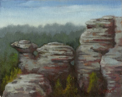
Camel Rock, oil on panel, 8x10
The Shawnee National Forest is one of my favorite places to hike and sketch.
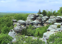 If you travel into the Mid West a person is immediately struck by the vast flatness of the region, great for corn farmers, not very inspiring for artists. As you wind your way through Illinois ”The Prairie State”, to it’s southern tip, the landscape takes on some dramatic changes. Here eons ago, great glaciers stopped and deposited their debris, then add in some massive geological events and you find yourself inside an entirely different landscape called the Shawnee National Forest.
The Shawnee is 284,000 acres of forest, wetlands, swamps, bluffs, and canyons with unique rock formations. A great destination for camper, backpackers, hikers, rock climbers, horse back riders and the adventuress Pochade Box Artist.
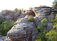 The park contains eight National Natural Landmarks, all worth seeing. However my favorite (and muse) has been The Garden of the Gods Wilderness Area, noted for its main canyon, spectacular views and towering rock formations with names like, Monkey Face, Anvil Rock, Devils Smokestack and Camel Rock.
We have made many trips to hike and sketch the area. And the rock formation called Camel Rock has become an obsession of mine to paint. My intentions are that once I complete a series of Pochades, I will produce a large studio piece of this landscape.
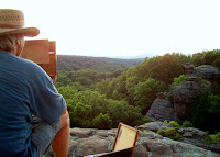 Our last outing was late last summer and as usual we ran into other outdoor enthusiasts, hikers and photographers. Unknown to us one of the photographers was working on a project sponsored by a local University to document the Shawnee. Which published a book titled, “The Shawnee Forest – Illinois’ Hidden Gem” and set up a multi-media website journaling and documenting the beauty of this unique forest. We purchased a few books as holiday gifts for friends and to our surprise found ourselves inside its pages.
I am working on this oil sketch of the Camel Rock and Linda snapping photos. A great giggle for us, considering how special this place is to us, and a nice way to end/start the year.
It’s also inspirational for me when my philosophy of synchronicity works.
Enjoy Jim.
For more information check out these links.
Shawnee National Forest
The Shawnee Forest - Illinois' Hidden Gem the multimedia website
Photographer Bobby Samart a must see... great work.
And for the backpacker/hiker
The Unofficial Shawnee Trail Guide
Subscribe to:
Comments (Atom)


