Showing posts with label color mixing. Show all posts

Wednesday, August 30, 2017

Grey Sunset


Grey is never colorless,
color is about comparable chromatic relationships.
Say that three times fast.


Grey Sunset, oil on panel, 5 x 7 inches, © Jim Serrett


Explore - Question - Learn - - Enjoy, Jim 


Website - jimserrett.com 
Studio Blog - jimserrettstudio.com 
Landscape Blog - Pochade Box Paintings


Wednesday, December 7, 2016

Studio Paintings - 3 Landscapes


I find trees to be one of the most interesting and complex things to draw and paint, there is just so much variety, from the different species and through the changing seasons they always present a new challenge. I see them as peaceful and contemplative; almost a meditation.

Autumn Shore, oil on panel, 9 x 12 in Jim Serrett


Daytime Moon, oil on panel, 8 x 10 in Jim Serrett

I had read that daytime moon was called a “children’s moon because their eyes were sharp enough to pick it out, where the old folks, with fading vision, could not tell it from the clouds.”

Turns out the prime time for a Daytime Moon is when the Moon gets close to its quarter phases that is the ideal conditions for it to be seen during the day. That is, it is bright enough, far enough away from the Sun to be seen, and rises or sets during daylight hours. When all of these conditions come together, and when the sky is clear enough, the Moon becomes visible during the daytime.


Keep an eye up to the sky, you never know what you might see.


Clouds Over Cedar Lake, oil on panel, 8 x 13 in Jim Serrett

I can spend endless hours watching the ripple rhythm and shadows sail across the lake.

These studio works are created from my Pochade studies, field sketches and my visual memory of an experience. In the studio I hope to let a concept evolve and speak with a little more information and clarity. In these works, I can explore my observations about nature in a more control environment and inject my personal vision and interpretations.

One of the characteristics of oil painting I enjoy most is the ability to create transparent, semi-transparent and opaque layers of paint. Manipulating those qualities can give an image a lot of texture and depth. I like the variation of greens you get with glazes and scumbling effects. You start playing around with the color green differently when you work in thin layers and use it to unify passages. Building up paint in layers of glazes and scumbles provides a arsenal of effects that can create atmosphere in a landscape painting.

I truly enjoy working through an idea with the process of creating thumbnails and roughs. Relying on observations made over time and my memory of the place, it becomes layers of thought, that for me, reach a higher level of understanding and refinement.


Explore - Question - Learn - - Enjoy, Jim 


Website - jimserrett.com 
Studio Blog - jimserrettstudio.com 
Landscape Blog - Pochade Box Paintings


Sunday, December 4, 2016

Four New Pochades


The sky was filled with colors.
The Light of the Sun, oil on panel, 5 x 7 inches, Jim Serrett


The sky on the way to the concert……
Tangled Up in Blue, oil on panel, 5 x 7 inches, Jim Serrett


At Paul Ice Recreation Area, I did not paint them into this little study but two little ducks were working this cove, diving under water and paddling around. Fun to watch as I painted.
By the Lakeside, oil on panel, 5 x 7 inches, Jim Serrett


Quiet moments on the lake - where the only sounds are lapping water on the shore and the whisper of the wind through the trees.
Whispering Cedar, oil on panel, 5 x7 inches, Jim Serrett


Explore - Question - Learn - - Enjoy, Jim 


Website - jimserrett.com 
Studio Blog - jimserrettstudio.com 
Landscape Blog - Pochade Box Paintings


Thursday, November 10, 2016

Impressions from a Lake


We are having an unusual autumn as the weather seems to be unable to make up its mind, cool then hot sunny days, then gray days without much rain. I think we have had them all. The nice thing is that we have been able to get out on the lakes in the kayaks a bit later this season and enjoy some of the color change.


The Fall color is a bit muted and I have read that this can be blamed on the very dry conditions. We still have quite a few pockets of green with a scattering of rust and earth colors. All of which makes for an interesting contrast of colors on the lakes.


This kind of scenery is perfect for my color choices, I mainly use a earth palette which tends to be more about tones and values than saturation. Naples Yellow, Yellow Ochre, Burnt Sienna, Burnt Umber, French Ultramarine is really about all I used on these pieces. These low key earth palettes will make you look closely at building color relationships and thinking about color saturation.


My pochade studies both on location and in the studio, are essential to my artistic development and process. They are where I gain that all important canvas mileage and experiment with color, composition and ideas. I try not to get too caught up if they are good or presentable, but if they answered those basic questions of how and why. How do I paint this to look like that and why am I painting that? 

My oil sketches start very simply with the big patterns of color and shape, looking for the abstract quality that unifies the scene before me. Nature is a highly accomplished organizer and she can be very complex, often it takes careful study to see her design. This is the challenge that keeps us engaged in the creative process. The exploration of light, form, space, and color interpreted through strokes and dabs of paint which communicate a sensual vision of the world. 

And then there is this thought; leave at least some hours in each day to enjoy the nature around you. Tune out from the daily chaos of life, and observe, draw or paint from nature.

Man-made noise is muzzled by nature's silence...


Kinkaid Lake Reflections
Evening Ripples
Johnson Creek
Lake Clouds
All pochades are 5 x 7 inches oil on panel, © Jim Serrett


More information on my color palette here.

Explore - Question - Learn - - Enjoy, Jim 


Website - jimserrett.com 
Studio Blog - jimserrettstudio.com 
Landscape Blog - Pochade Box Paintings


Wednesday, September 30, 2015

Sketching the Landscape


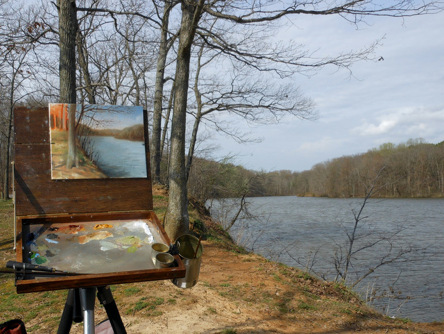
The weather is just perfect for some location painting. Getting out there and doing studies and sketches and building a library of ideas to develop over the winter months into studio paintings. For those of you familiar with my Pochade box you might notice I have added a glass palette with neutral gray backing. I think the patina on the wood palette was getting so dark that I was having problems seeing the darker values. I really miss the wood surface, I just kind of like the feel of it. The gray residue and chunks of paint seem so much more interesting. Maybe when I get some down time I will resurface the wood palette and start again. But for now the gray glass is sure convenient and easier to see the color on with these ageing eyes.


I think my landscapes have evolved into a study and investigation of atmosphere. I want the ariel or atmospheric perspective to carry the viewer throughout the picture. I really feel that to express my response to the landscape I must impress the environment upon the viewer and make them swim within the air. So I have been pushing this idea and incorporating multiple layers of glazing and scumble to achieve that feeling. 


Explore - Question - Learn - - Enjoy, Jim 


 Website - jimserrett.com
 Studio Blog - jimserrettstudio.com
 Landscape Blog - Pochade Box Paintings


Monday, June 30, 2014

Watercolor Color Palette - Sketchbook


Whenever I use color in a sketchbook I like to make a small color wheel and color chart to see just how the watercolor reacts and lays down on the paper. It is also a good review about basic color mixing that we tend to take for granted.  A color palette is the actual range of pigments used by an artist, learning how they behave when they are mixed together is essential. Studying color is a fundamental aspect of painting and to that end artist create color charts and color wheels.

Materials Links:


Explore - Question - Learn - - Enjoy, Jim


Saturday, March 29, 2014

No Expectations.....Wind, Water, Waves and more Caribbean Seascapes


The crash of waves is just a symphony of sounds and images, I knew I wanted to paint something that reminds me of the experience and retells that serene moment. How I would approach the idea weeks later sitting in my studio in the middle of a Midwest winter was to rely heavily on my sketches from the beach and my visual memory. This work was the combination of watercolor sketches, drawings and imagination. So it became a blend of observation and interpretation. It is such a beautiful beach, I hope my memory does it justice. 


This sketch was painted on the beach in Cancun Mexico. This was a tough sketch to do on location because of the intense sunlight. I knew I would struggle with values, even when squinted down it was hard to separate values. Plus I think there was a bit of sensory overload. I just need to keep in mind that painting on location is much more about learning to see than it is about producing a finished image.


The goal is to take the information that nature presents in front of me and express my reactions and feelings about that subject. Which is something a camera cannot do and by staring at a monitor in a studio, you will never experience. When painting on location you have to, at some point trust the process rather than focus on the end result and just let go of expectations. It is also important for you to enjoy the process, in this environment I could have happily spent hours just mixing different shades of blue, learning new colors, discovering new paint mixes on my palette and having the time of my life doing it. There is no better way to hone ones skills.

Wind, Water, Wave, Oil on panel, 9 x 12 in. © Jim Serrett
Cancun Beach, oil on panel, 9 x 12 in. © Jim Serrett


"No Expectations"   Mick Jagger / Keith Richards

Take me to the station
And put me on a train
I've got no expectations
To pass through here again
Once I was a rich man
Now I am so poor
But never in my sweet short life
Have I felt like this before
Your heart is like a diamond
You throw your pearls at swine
And as I watch you leaving me
You pack my peace of mind
Our love was like the water
That splashes on a stone
Our love is like our music
Its here, and then its gone
So take me to the airport
And put me on a plane
I got no expectations
To pass through here again

The Rolling Stones
Mick Jagger — vocals
Ronnie Woods — slide guitar
Keith Richards — acoustic guitar
Bill Wyman — bass guitar
Charlie Watts — claves
Nicky Hopkins — piano


Explore - Question - Learn - - Enjoy, Jim


Thursday, March 29, 2012

Prelude to Spring + Earth Tone Color Chart


Jim Serrett     Prelude to Spring     Oil on panel     8x10

The painting above was done over three sittings on location around mid afternoon. The first sitting was a simple washed underpainting of burnt umber to establish a tonal composition.

I approached this landscape painting with more of an indirect/layered method, a process of painting on top of a dry layer allowed for some dry brush and glazing techniques.

I have been working with a simple Earth Palette comprised of four colors, yellow ochre, burnt sienna, burnt umber, ultramarine blue, and white. These low key earth palettes will make you look closely at building color relationships and thinking about color saturation.


Much of the subtly in these color families can not truly be seen or appreciated unless you actually mix one of these charts. For example ultramarine blue mixed with burnt sienna or burnt umber produce two beautiful mixed blacks and an entire range of warm and cool grays. This is what I used in the study Prelude to Spring and in the chart for my mixed black or shade.

There is more info about the earth palettes on my studio site.


In the spring, at the end of the day,
you should smell like dirt.
                                                    Margaret Atwood
                                   

Explore – Question – Learn – Enjoy, Jim


Monday, June 28, 2010

Three Color Palette


Further on down the road
10x8
Oil on panel

If you have been doing a lot of studio work, it’s easy to fall into a routine.
Your color sense and choices can become predictable. The best way to shake those cob webs is get outside and do some sketches with a limited palette.


Midwest Scenic
7x9
Oil on panel

These pochades were done with a three color palette of cadmium yellow, permanent alizarin and French ultramarine. The simple three primaries will produce an inherent set of color harmonies. I wrote about this limited palette earlier here. You may not match every color you see perfectly but you will certainly produce better overall color harmony.

Using a limited palette will force one to truly look at what those secondary colors are composed of, and push you to really see the color qualities of temperature, value and chroma/intensity.


Out the backdoor
10x8
Oil on panel

A limited palette and some quick sketches can be refreshing. In the end it’s about being able to express what you see through color. It is about gaining experience, not producing frameable work after all.  Art is not about a product, but an evolving and developing process.
I learn something from every painting I do, even if it’s only what not to do next time.
The lesson this week is to paint and persevere.
Plain and simple.

Enjoy Jim

Friday, April 23, 2010

Mixing the color Green

Mixing the Color Green / Early Spring


Spring has always been considered a time of rebirth, renewal, and growth.

For artists it is a return of a favorite muse, or maybe we should say a cunning nemesis called GREEN!

Let’s face it, artists have a love hate relationship with the color green.

Maybe its those 70's era mint green walls my mother had, or the descriptive words people commonly associate with green, lime green, kiwi green, pea green and yes the infamous sea foam green.
What the heck is sea foam green?
I doubt any other color has as many preconceived ideas or notions surrounding it.

Further confounding the problem is the use/abuse of premixed, manufactured tube greens. Combined, these can easily lead to some very artificial looking colors which can completely zap the life out of any painting.

And yet for a landscape painter it is this color we must deal with most often.
To deal with green we must get rid of the preconceived notions.

Early spring is the best time of year to develop an understanding of mixing the color green. We still have a great deal of winters colors, the browns, oranges, and grays, (all of greens complements, which are the real key to dealing with this color), behind a backdrop and explosions of yellow-green, green, and blue-green.
Right now you can clearly see the neutralizing effect of these complementary hues.
I think there is no easier way to use and harmonize green than to mix it from the primaries. When using a limited palette based on the primaries you immediately build color relationships and harmonies into your secondary colors. All your pigments are now interrelated and unified.

A simple palette of cadmium yellow, ultramarine blue and alizarin crimson will work very well, and have been associated with many prominent Plein Air painters such as Kevin McPherson. I use this palette often, but feel it leans to the warm side. Mixed it would look something like this.


I however favor a six color palette (split-primary palette) that is basically two versions of red, blue and yellow. By adding just three more colors to the limited palette, lemon yellow, cad-red and cerulean blue. You gain a much larger range of choices. This is what these three hues alone look like when mixed.


When you compare the two sets of primaries you will notice the difference in the warm and cool color temperature range.


What we end up with is a six color palette that can clearly represent the entire visual spectrum. Each of the six colors leans towards a secondary color.  Lemon yellow, (a yellow-green), cad-yellow, (a yellow orange), cad-red, (a red-orange), alizarin crimson, (a red-violet), ultramarine blue, (a blue-violet) and cerulean blue, (a blue-green). This is visually how all six relate on the color wheel.


When you examine this palette you can see the range and variety. There are some nice high chroma yellows, contrasted by some deep violets. With a superior series of cool receding hues that give a fuller array of greens. The yellow-green (lemon yellow) mixed with a blue-green (Cerulean Blue) will give us a brighter mixed green because both colors are moving towards each other on the color wheel. While in contrast using a yellow-orange (Cad.Yellow) and blue-green (Cerulean Blue) will give use a duller mixed green because both colors are moving away from each other on the color wheel. And possess each others complements of orange and blue.
You can repeat the same process for all colors on the wheel mixing your key color with one that moves in the same direction (brightness) or opposing direction (dullness).
Making color mixing less haphazard and unpredictable, giving us more control over the palette and matching color.

 Keep in mind that in the above wheel we are using these hues directly from the tube, no white (tints) or complements (grays) mixed into them, it is easy to see that there is a complete range of relationships to start your modifications from. And you will see the potential of the split primary palette.

You now have a full arsenal at your disposal.


March
7"x9"
Oil on panel


April
7"x9"
Oil on panel


May
7"x 9"
Oil on panel


What I truly like about this palette is that it is very flexible. I will often pull one of the primaries out and replace it with another hue that fits in the color wheel. Replace a yellow with a yellow ocher or a red with Venetian red as the image in front of me dictates. Venetian red, burnt sienna, raw and burnt umber are handy pigments and if they help speed up mixing time I’ll add them to the palette. But you can mix similar hues out of the limited palette. I am not opposed to adding a color to the palette for convenience, but note that I do not use manufactured green.

The manufactured pigment green requires endless modification to be of any use in real relationship to the observed world. Think of how much you would have to change Viridian pigment to use it in the foreground, middle ground and background of a painting, I would have to make it the correct hue, value, and chroma. Warm it - cool it, lighten it - darken it and grey- neutralize it, and then hope to modify and harmonize the other colors of your palette with it. You will have a much easier time harmonizing a dominant, prominent color such as green when it is made from the rest of the family of colors on your palette, and start out in the ball park of the color you really want.


If you trust nature, that she will naturally harmonize color for you under her light.

Remove green from your palette, arm yourself with the right tools and you can simply mix it as you see it in nature.


Enjoy Jim