Showing posts with label composition. Show all posts

Wednesday, August 30, 2017

Grey Sunset


Grey is never colorless,
color is about comparable chromatic relationships.
Say that three times fast.


Grey Sunset, oil on panel, 5 x 7 inches, © Jim Serrett


Explore - Question - Learn - - Enjoy, Jim 


Website - jimserrett.com 
Studio Blog - jimserrettstudio.com 
Landscape Blog - Pochade Box Paintings


Thursday, February 23, 2017

The Artist and His Muse - Dutch Ridge, Cedar Lake


I paint what I see as I find it in nature, mostly. I never paint it exactly, I pick and choose elements I like, move a tree here or there, add more interest to the clouds. Do some rearranging and compose some harmony out of all the chaos to make visual sense to me.

What I always strive to do is stay true to the original idea, in it is the source of inspiration.

Without inspiration you are just making marks. No matter what embellishments I may add or take away in a painting, they must support the original concept. What is the painting about, is it the sky? If that is the inspiration, then everything supports that idea. When you know what to emphasize in a scene you understand what elements to manipulate to better communicate the feelings you have about a particular place or time. When its about the mood or feeling of a place then your choices should speak to that connection. That relation is certainly the hardest concept to focus on and express in a painting.


Dutch Ridge, oil on panel, 9 x 12 inches, ©Jim Serrett

This becomes the artist-muse relationship, that goal to capture something illusive, intuitive, private, visceral or complex. It becomes a creative force of its own having the power of moving the intellect or emotions.

I am not certain how many sketches and paintings from Cedar Lake I have done; I just know I am not finished.

“I'm not in control of my muse. My muse does all the work.” Ray Bradbury


Muse; noun: Muse; plural noun: Muses; noun: muse; plural noun: muses
1. (in Greek and Roman mythology) each of nine goddesses, the daughters of Zeus and Mnemosyne, who preside over the arts and sciences.
2. a person or personified force who is the source of inspiration for a creative artist.

synonyms:
inspiration, creative influence, stimulusformal afflatus "the poet's muse"


Explore - Question - Learn - - Enjoy, Jim 


Website - jimserrett.com 
Studio Blog - jimserrettstudio.com 
Landscape Blog - Pochade Box Paintings


Tuesday, January 31, 2017

Even in Front of Nature One Must Compose.


Nearly all of my work begins with some type of preliminary sketch, either a thumbnail drawing in a sketchbook or oil study in my Pochade Box. Lately I have been spending a great deal of time sketching, gathering information outdoors and drawing from my imagination. Creating small rough abstract sketches to work out composition and design elements. 


Mainly I am using pen and ink with watercolor. I like the ink because you don’t fiddle with it as much as say a pencil sketch, you just have to lay it down with some speed and confidence. It is very permanent mark making and you simply/humbly live with what you put down and move along. Over that I wash in some color, do some crosshatching and try to capture the value and mass pattern. I call them my scribbles; and that is what they are, quick notations of design ideas based on nature.


They are exercises in capturing what I see in front of me from direct observation (the Art of Seeing) but also it is about the simple pleasure of drawing.


I look for a strong arrangement of dark and light patterns, the Japanese use the word Notan which means the "dark-light" harmony.  But a notan is also as much about shape/form, positive/negative, figure/ground relationships. It is why it is such a strong abstract design tool. I like to think of it as being the ying-yang of composition. Ever walk into a gallery full of art and be instantly attracted to a particular piece, drawn to it from across the room? Our eyes are drawn to the strong arrangements of shapes and patterns. As you learn to use this design tool you will recognize it in paintings and drawings of master artists.


Slow down mentally and take a long look at your subject, carefully choose the center of interest or theme of the piece, what it is about, what has drawn you to this motif and design outwards from that point. Simplify and edit down the elements by making them subordinate to that central idea. That is the key to good composition.


It is fun working out compositions and concepts, playing with the elements and ideas based on the anatomy of the landscape. Let them evolve and "brainstorm" many studies, before you know it you will have sketchbooks full of Composition Thumbnails which are a library of knowledge and imagination to work from.

“Even in front of nature one must compose.” ~ Edgar Degas


Color Studies:
Last Light, oil on panel, 8 x 10 in, Jim Serrett

Over the Horizon, oil on panel, 8 x 10 in, Jim Serrett


Explore - Question - Learn - - Enjoy, Jim 


Website - jimserrett.com 
Studio Blog - jimserrettstudio.com 
Landscape Blog - Pochade Box Paintings


Links:

Notan is a Japanese design concept involving the play and placement of light and dark as they are placed next to the other in art and imagery.


Sunday, May 29, 2016

Punta Nizuc Reef - WIP


These are two studies based on my sketches from Mexico at our favorite snorkeling spot. They will be the source of a larger studio painting. I am working out the design idea based on my sketches and studies done on site, while relying on the memories of the place and the connection I have to it. It is this visual library of references that I will based the finished work on.


In the studio I ask myself a million questions – how to describe the shadow of these clouds, where is the horizon line seen and what colors are in the Caribbean Sea?, to name a few. Organizing all of the questions and answering them in a color study will aid me in the finished piece. I tried two versions based on my drawings with slightly different vantage points and lighting to establish the mood of the painting. With these I hope to create out of my mind's eye, my memories, and my feelings for the amazing place and experience.


Punta Nizuc Reef, Color Studies I and II, oil on panel,  9 x 12 in, © jserrett


Explore - Question - Learn - - Enjoy, Jim 


Website - jimserrett.com 
Studio Blog - jimserrettstudio.com 
Landscape Blog - Pochade Box Paintings


Sunday, December 20, 2015

Nature speaks in color, sometimes it is a whisper, sometimes a shout.


Nature speaks in color, sometimes it is a whisper, sometimes a shout. From the hints of earth tones in early autumn to the dramatic sky of a winter sunset she provides endless designs to study. The elements of earth, sky, water are in a constant state of flux but nature always keeps them in harmony.


Early Autumn on the Lake oil 5 x 7 inch Pochade


Early Winter on the Lake oil 5 x 7 inch Pochade


Explore - Question - Learn - - Enjoy, Jim 


Website - jimserrett.com 
Studio Blog - jimserrettstudio.com 
Landscape Blog - Pochade Box Paintings


Saturday, May 30, 2015

Seascape Sketches


The following are some of the materials I have been gathering for a pair of studio commissions.

The idea is a seascape diptych that would be hung in a specific space in the patrons home, and these drawings are part of working out the compositional concept. How the eye would travel from one panel to the next and how each individual painting will stand on its own have been the concerns.


I want to have a clear concept of the the elements in each panel. Where the sky planes are and the atmospheric perspective. What is in the foreground and middle ground, and still understand the whole. The best way for me to do that is to work out a series of thumbnails and sketches. Gathering as much reference material as possible.


Not only am I working out the technical aspects, but also the mood, emotion and harmony of the paintings. Exactly what I am trying to “say” with these two paintings.


Graphite and white gouache on toned paper. 5.5 x 8.5 inches


Explore - Question - Learn - - Enjoy, Jim 


Website - jimserrett.com 
Studio Blog - jimserrettstudio.com 
Landscape Blog - Pochade Box Paintings

Sunday, October 30, 2011

A nod is as good as wink to a blind horse.


Quick studies and oil sketches are about expressing the essential features of a subject without getting hung up in the details; it is concerned with building observational abilities and information gathering.  I've driven this route many times and always liked the lay of the land, but on this day I was inspired by the patterns in the sky against the curve of the road.


 The Valley Tree Oil on panel 5 x 7 in
This work is available – click here for purchase information

Sketching with a Pochade is a very personal act; it is in connection with developing a good visual memory in front of nature through observation, experience and study. This is another location I've observed numerous times, the rolling pastures and lone group of trees has become part of my visual library.
.

 Cedar Lake Dutch Ridge Oil on panel 7 x 9 in
This work is available – click here for purchase information

I don’t think it is important to attempt finished looking work when field sketching because it is not about a “masterpiece” but has more to do with a learning experience and honing my skills.
Often just capturing color and form and leaving the details to suggestion is enough to convey the spirit of the landscape. I've spent countless hours on Cedar Lake in a kayak, but am always amazed at how different the interaction of sky and water can be, unlike history the landscape never repeats herself.


I think that many plein air groups today are missing this idea and more concerned with the “plein air persona” and producing finish work than honest painting. And that is why so many plein air paintings look so homogenized. 

  Art is not a group activity.


  First Fall Oil on panel 8 x 10 in
SOLD

Anyway back to the oil sketches, a good oil study may stand on its own merit or becomes a reference for a large scale studio painting. But the best studio landscapes are composed from the combination of those field studies and personal observations relying on, to a large extent, visual memory. Working on location will help train those painting muscles by forcing you to see simply and commit to memory deeply, your response to the subject. Either way it will build your personal connection and understanding of the character of the landscape.


 Which brings me to the title of this post, 


"A nod is as good as a wink to a blind horse."

Meaning: A very small hint is enough to convey our meaning. It is not always necessary to say what we want explicitly.


I look at the sublime simplification within a Sargeant, the ambiguity of a Turner, the strength of design in a Payne, the light and movement in a Constable or that sense of space and emotional drama in a Duran.

And I say, they knew what Leonardo da Vinci meant when he stated,

“Simplicity is the ultimate sophistication.” 


“An artist must be curious.”   

 -- Leonardo  da Vinci


Saturday, January 15, 2011

Squaring Up - Pochade to Studio

Studio painting from plein air reference.


When you translate a Pochade into a larger work you must also translate the “feeling” or inspiration of that piece. For works that go from Pochade to studio I must have a strong connection to the work, something familiar, memorable and really linked to my senses, emotions and intellect, if I am going to express that “sense of place”.

For me the true power of any good landscape is the ability to capture and convey the immediacy and drama of the scene to the audience. I felt if I could stay true to the mood and energy of the study it would be good candidate for a studio piece. Without that I would only be reproducing a statement I have already made.

 I liked the composition and elements of the study, “The Cliffs of the Dawn at Isla Mujeres” but I felt there was so much more that could be said with this image. Isla Mujeres is a corral island and the cliffs are carved by wind and wave over centuries. The effects of light and water on the cliffs are very unique. The dry corral under the Caribbean sun turns nearly bone white, while the wet corral picks up warm yellowish tones all contrasted by the deep warm shadow areas below the cliffs. I wanted to emphasize some of those nuances and subtle effects that I could only suggest this in the Pochade.


Click image to enlarge.

Squaring up is probably the simplest and most accurate method to enlarge an image. From your original sketch select a larger canvas within the same proportion and ratio. In my case the Pochade is 8x10 inches; my studio canvas is 24x30 inches, 3 times the original size. To transfer the design to the larger canvas the Pochade is grided at one inch squares and the studio canvas at 3 inch squares.

If you’re not enlarging at a 1:1 ratio use an architects ruler, a very handy tool for scaling drawings, it will give a variety of scales to use.

I often outline the sketch with tracing paper and grid it, this time I just made a black and white copy of the Pochade and did my grid on top of it. I squared up the large canvas, and gave it a, “imprimatura” wash with a mix of Burnt Sienna and Raw Sienna to provide a nice warm undertone.

With the Pochade as reference and the squared up B/W copy, it is just a matter of placing inside each corresponding grid as little or as much information I think I will need to create the larger work. Looking at the pattern of light and dark loosely sketch the image. Some areas will have contour lines to suggest form while others washes of broad tone to suggest shadows.

The canvas sketch, although loose was very accurate to the Pochade. Having my design strongly stated, the structure and pattern established, I could concentrate on the color lay in. I did not want to just transcribe and copy the Pochade. But recapture the mood and its atmosphere. I needed to keep the energy of the original sketch alive. The rest of the painting process was a combination of direct and indirect methods, with most areas done “alla prima” or wet into wet in one sitting. Keeping the brushwork loose and painterly I think helped produce within the studio piece what originally inspired me at Isla Mujeres.

In fact maybe I should go larger again?
Hmmm.

Enjoy, Jim


Saturday, October 30, 2010

The whole is greater than the sum of its parts.

Learning to simplify.
Setting up your sketch box and starting a painting on location can at times be overwhelming. Sorting through all of nature’s complexities and distilling that information down to its basic elements is no easy task. When confronted by the natural world, at times it seems we are trying to bring order to chaos? Even once we have the forms and masses blocked in we still must decide on how much pictorial detail (what to put in, what to take out) we need to include to convey the scene and intention of the piece.
The best advice to simplify your subject is to see it as uncomplicated complete patterns of shape, massing in shapes like puzzle pieces and eliminating unnecessary details. This is certainly a well founded and conventional approach. But only as long as we keep the intention of the scene and see the patterns of the whole. So no matter how simple we begin we are always involved with composition. And to simplify composition we need to understand its elements.

If a really great painting is more about what we leave out than put in, we need to know what those things are that we left out.


Most artists have already been given the tools to deal with simplifying way back in the basic design classes we took. Condensing complex imagery into understandable and communicative forms is basic design fundamental.

The Elements of Art: -Form-Line- Shape-Color-Texture-Space-Value
The Principles of Design: -Emphasis-Balance-Harmony-Variety-Movement-Rhythm-Proportion-Contrast-Unity.

The organization of these fundamentals forms composition. Composition is the organization of related elements into a meaningful coherent whole.
The word composition means put together – “com” is together – “ponere” means put.

So it is the “act” of composing or compounding. The mechanics of composing can be analyzed by these formal fundamentals separately however these elements become interrelated and dependent upon the other.

So it is important to appreciate them individually and but more importantly
understand them when acting together.
This idea is beautifully and simply express by a great Greek philosopher.

“The whole is more than the sum of its parts.”  Aristotle


An artist needs a strong understanding of these fundamentals to compose and to simplify.
They are tools that will be used over and over and need to be embedded in a students mind so that they can become instinctive and non cognitive.

"A painter needs to study, meditate and experiment and practice interminably in order to produce a painting that would have nobility in its concept, variety, rhythm, repetition, unity, balance and harmony in its composition"
--  ( Edgar A. Payne )

"There can be no dissent from the maxim, that a knowledge of integral parts is essential for the construction of a whole - that the alphabet must be understood before learning to spell, and the meaning of words before being able to read"
--From Asher B. Durand's 1855 Letters on Landscape Painting


Learning to see the whole.
Select a great work of art you truly admire and critique it by basic design fundamentals.
One can quickly pick out the artists use of elements and principles, and still not find what exactly gives that particular work its excellence or intrinsic appeal. (Elegance and beauty). There is an inherent quality in great masterpieces that defy/challenge technical analysis or description.  To see the aesthetic value, we often have to look for what is not there. This leads to the second aspect of composition, which is more intuitive and based on our feelings or sense towards the subject, “Expression”, which we must consider an element of composition, no matter how elusive or hard it may be to describe. Is the most powerful and lasting element in art. It can make contact with our senses, emotion and intellect.
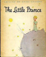
L'essentiel est invisible pour les yeux.
 ("One sees clearly only with the heart. The essential is invisible to the eyes.")
The Little Prince  by Antoine de Saint-Exupéry  

We can mimic each of those elements, combine them and not create a work of art of any inherent value. Why, because we create art as a whole, it is not a collection of pieces.
This intrinsic appeal or quality transcends fundamentals for they have become second nature to a master painter. It is a deep bedded artistic language requiring no more effort on their part than breathing. What we must emulate is the intellectual process, making fundamentals an innate part of our daily thinking and artistic vocabulary.

“A main objective in the art of painting is to disguise, insofar as possible, the use of methods or the influence of principles.
  This concealment creates, so to speak, a great mystery – an attractiveness, unseen and indescribable. This abstract quality is the element that places pictorial work in the realm of fine art.”

- - (Edgar A. Payne)

I started this article wanting to talk about learning to simplify. So how did an article about understanding the essentials evolve into such large topics as the elements of art, principles of design, Aristotle, Gestalt theory and intrinsic appeal?
A well composed painting is a complex thought process of simplification.

Simplification “is” composition. To create compositions we must understand elements of art intrinsically. So that we can remove them at will creatively and inventively.
Great composition is more a matter of what you leave out than what you put in.  

Explore - Question - Learn - Enjoy, Jim


Links:
Edgar Payne Gallery
Composition of Outdoor Painting by Edgar A. Payne

Asher B. Durand - biography
Current Durand Exhibition / Madrid 
Kindred Spirits - Asher Durand and the American Landscape 

Credits: 
Statue of Aristotle at the university of Freiburg im Breisgau, Germany.
 By Cipri Adolf Bermann (1862–1942)
Photo: Michael Schmalenstroer

Mr. Payne and Mr. Durand and Mr. Aristotle and Mr. Saint-Exupéry